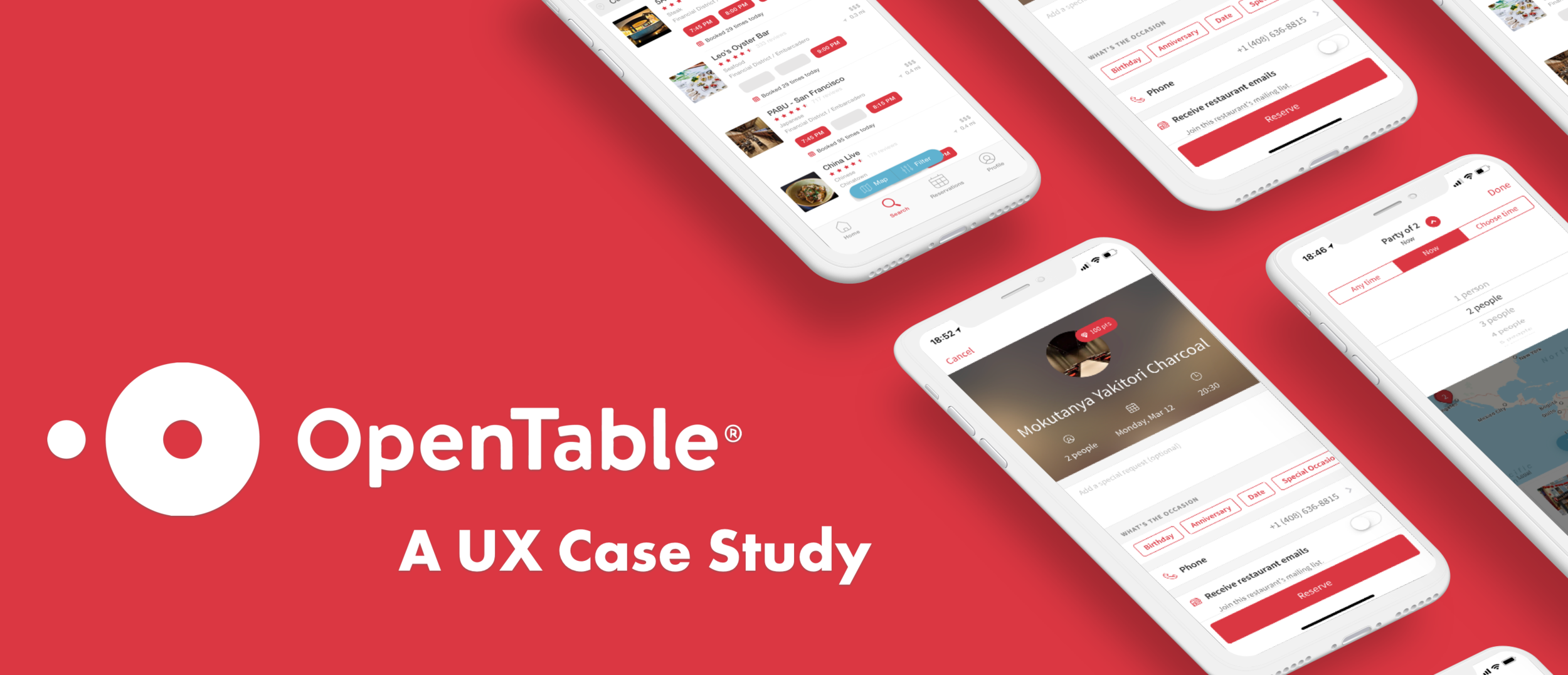
Background
OpenTable is an online restaurant reservation system that allows customers to easily book, manage, and cancel reservations for restaurants all around the world. Their mission is to reduce friction in the reservation process while also enabling restaurants to fill empty tables.
As someone who spends her weekends exploring and trying out new restaurants and cuisines, I decided to set out and uncover the pain points behind the iOS app, and find any potential drop-offs where there could be opportunity.
UNCOVERING Pain Points
I spent an entire day running guerilla tests on 6 unsuspecting participants around San Francisco, most of whom were familiar with OpenTable but had never used the mobile app before.I had the users do some simple tasks:
Book a dinner reservation for tonight, party of 2.
Share their dinner reservation with the person joining them.
Modify their brunch reservation to include one additional guest.
Cancel their existing dinner reservation.
There were a handful of recurring pain points and frustrations, specifically around searching and filtering for availability and preference.
Filters: Users had difficulty finding out where to create, modify, and clear filtered results
Setting the Time: Users expected to set the time of the reservation in the filter, instead of at the top of the screen
Unavailable Restaurants: There was confusion for why restaurants with no availability near the time-range was included in the search results
Modifying Reservations: Several mistakes were continually made when users tried to make modifications to existing reservations
After poring over and reviewing each participant’s experience with the app, I started to map out the user flow with the app when it came to making a reservation. This helped me get a better sense of where along the flow there were problems and if there was any relationship between them:
The Process
PRIORITIZING THE PAIN POINTS
After poring over the results from guerilla testing, I started to group the recurring frustrations into bigger arching themes and tasks. I broke up the “Search” function into 3 parts: Filtering for Time, Filtering for Cuisine, and Discovery.
I then started to plot out the themes on a 2x2 to prioritize between user needs and business goals, while also highlighting a few low hanging fruit that would seemed to require relatively simple modifications.
THE CURRENT SEARCH VIEW
THE SOLUTION
Below you can see the changes that were made.
FINDING THE FILTERS
Problem: Users weren’t able to find the filters for making preferences or time changes.


